
Journalist Seth Franzman does not seem to be a believer in widespread media bias against Israel. But a Guardian report (shock, horror) on health care around the world has him metaphorically shaking his head at the bias on display.
I’m not one of those people who buys into the “media hates Israel” exaggeration usually. But sometimes an error is so egregious that it seems it can only be the result of extreme editorial and reporting bias.
It is not something that jumps out of the page immediately, so please bear with me.
As Seth points out, the article profiles countries around the world, confining its analysis to “some of the world’s leading countries for healthcare.” And it includes graphs relating to healthcare issues, which upon hovering your mouse over faint lines , emphasizes the line and includes a label identifying the country to which the line pertains.
These countries are: France, Ireland, Sweden, China, Israel, US, Japan, Spain, Italy, Germany, Russia, Australia and the UK.
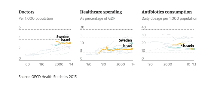
The article also contains a description for each of these countries. Well, almost.
Then the article includes descriptions of health care in each of these countries….except one. Israel. Israel interestingly didn’t rank badly compared to all these other countries. It wasn’t stellar in any one category, but it wasn’t the worst. That’s because Israel’s health care system actually works pretty well.
But for the authors of the short several hundred word descriptions of the state of health care in each country, for some reason there was no description of Israel.
Why was that? Why include Israel in the graphs but have it be the sole country that didn’t receive a description? It’s true that other OECD countries didn’t receive a description, but they were not on the graphs either.
As Seth I think rightly concludes, painting anything Israeli in a not negative light just doesn’t fit the narrative they are hawking.
And that is sick.