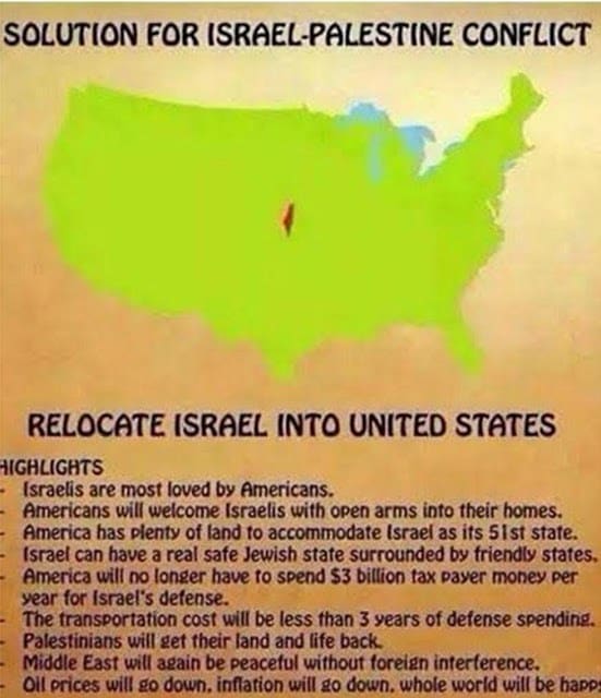
In all the hullabaloo over Bradford MP Naz Shah’s tweeting of a map something was overlooked. This is the map she tweeted:

Notice something about the shape of Israel? Yes, that’s right. Naz Shah has seen fit to include ALL of Israel including our biblical heartlands Judea and Samaria (aka the West Bank) and she’s even been generous and thrown in Gaza too.
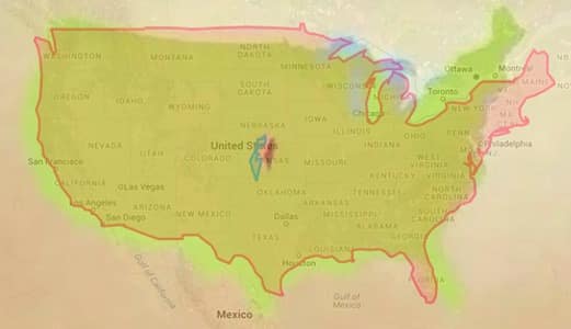
I don’t need to tell Israellycool readers why this is so dumb, but just for fun I used a more reliable way of comparing the size of Israel with US. (The same one I made my movie about where Ryan Bellerose comes from.)

Unfortunately thetruesizeof.com isn’t as generous and seems to leave behind our heartlands.
If we put this with the other map we get:
Which seems to me (setting aside slightly different projections) that’s Naz’s map mildly underestimated the size of Israel.
Which isn’t all that surprising. Considering the actual map came from veteran Israel and Jew hater Norman Finkelstein and has been used by the Jew haters at Jewish Voice for Peace. Everything becomes clearer when you carefully identify your sources.


